The Expoliation
massa critica | davide tommaso ferrando
Having recently been there, in the last few days I have posted on my social accounts some visual comments about Expo Milano, and especially about the Bahrain (like) and Italian (frown) pavilions, which generated quite critical reactions among some of my Facebook contacts, principally due to how the Palazzo Italia posts were written, that is, in a not so pondered way – to use a euphemism. With this final text I’d like to offer some more objective thoughts on the matter, which I believe to be an important one for a couple of reasons I’ll try to enucleate.
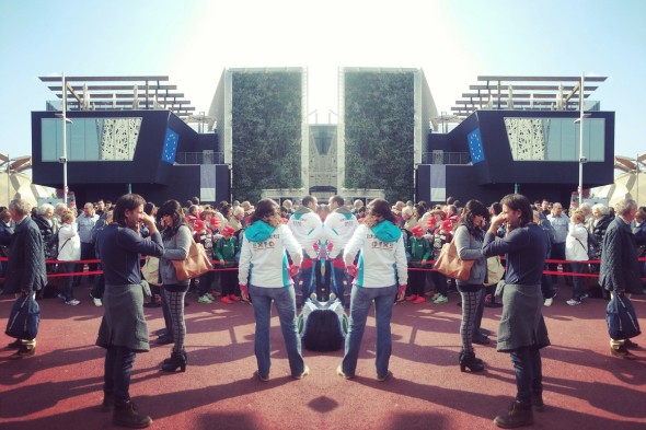
Let’s make it clear: from the moment I entered the Expo 2015 site, all my attention was focused on reaching the Italian pavilion as soon as possible, so to have the time to wander around it, sneak inside of it, take some strategically-positioned pictures with my smartphone, and figure out what I could write about it, more or less in the same way I did earlier with the Fondazione Prada, only in a harsher mood.
No, I have no problem with “architectures that look digital”, as ecoLogicStudio director Marco Poletto has commented to one of my three angry posts. Which means: it is true that they are not my cup of tea, but as much as I try to be a good critic, I feel compelled to look for the architectural everywhere, even in those places where I wouldn’t expect to find it. But yes, I have a problem with the Expo phenomenon, especially with this specific Expo (for the economic and political reasons we all know, so I won’t go through them here), and I have a problem with the Palazzo Italia, as far as it is supposed to exemplify an intelligent architectural thought in representation of Italian design. Ah, I also have a problem with the Tree of Life, but who doesn’t?
The problem I have with the Italian pavilion is manyfold: each part of it is related with the others, and all of them go back to a wider and more problematic issue that is strictly connected with the future of both World Expos and architecture, as far as I’m concerned.
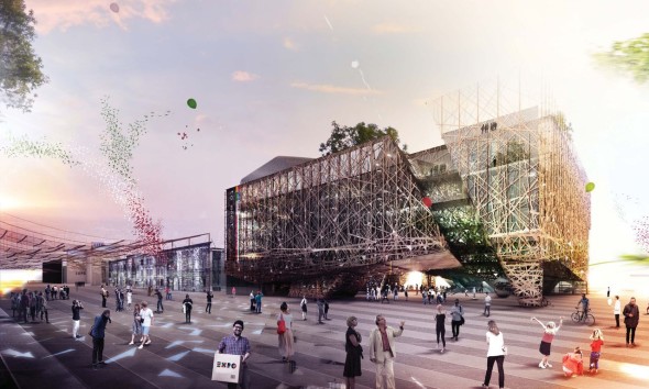 A view of Nemesi’s winning proposal for the Italian Pavilion at Expo 2015
First of all, I find the project by Nemesi & Partners wrong. A part from the fact that what’s built now is very different from the competition proposal (and in a way that doesn’t just make you think of technical issues that needed to be resolved during the design process, but of a more generic second-thought on the whole), I could see from the distance that something bad was going to happen, sooner or later, when it was first presented in 2013. Something that happens everytime architecture is presented by means of hyperrealistic renders that transmit dreamy atmospheres meant to strategically distract the eye of the observer from the “what”s and “how”s of the project. What material was its perforated facade going to be made of? How were they going to make it so incredibly thin? And what about the ondulated glass ceiling of the main hall, apparently made only of a layer of transparent film? I don’t know if they had the answers to these questions two years ago, but today they remain as memento.
Then there is its rethoric. Green roof (disappeared in the final version), sustainability, Italianness… In an Artribune interview published in January, Michele Molè (founder of Nemesi) talked of his project in terms of a “petrified forest – not a nest, like that of Herzog & De Meuron – that puts its roots into the ground and than spreads its branches vertically”. There’s even a video, again by Nemesi, that explains how “the Italian Pavilion takes the form of a natural architecture” (without explaining what does this oximoron mean), and in the project description the building is defined as an “architecture-landscape”. All these – and other – improper uses of metaphor and language make me sad. About metaphor, I can’t see the value of it in architectural terms: why saying that the Italian pavilion is (while knowing it isn’t) a “petrified forest” should make it a better architecture? People always give their own interpretation to what they see (in Alicante, everyone knows Subarquitectura’s tram stop as “the cheese”), and these interpretations usually differ from the intentions of designers. So why bother? About language, it is sad to remember how in the first years of the Modern Movement the written word had almost a sacred status, as it was regarded as the vehicle through which architectural knowledge was made possible and transmitted, while today, text is often another rethorical tool meant to fill the gaps of otherwise empty projects, while surfing the wave of the most fashionable terms of the moment (how can a steel structure be sustainable in the first place?).
Of course, the building has some qualities: it is iconic (a prerequisite for any Expo, with few exceptions), it has the size and figure of a palazzo, it plays with spatial complexity, the main covered hall allows people who have no time for long lines to immediately experience the best part of the project, the overall composition is ok if you are into this kind of language – although it is all achieved by means of a 2000s Zaha Hadid/Morphosis style almost exclusively applied to its skin, which doesn’t say much about the present or future state of architecture. But still, I believe that form and content should be one interwined thing, that a facade is not something that can be isolated from its building, that arbitrariness is a condition to be avoided as much as possible, that shapes emerge out of the design process and not the other way around, that economy, intended as the capacity to do more with less, is an essential ingredient of any architecture, that each little element of a building should be disposed in the most intelligent way. All beliefs that clash against the actual Palazzo Italia, in a way that brings me to the last, and most problematic, issue.
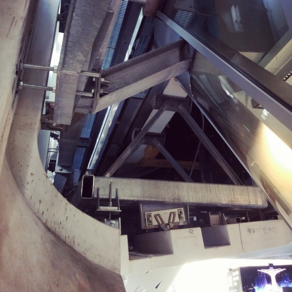 Architecture VS scenographed engineering: a peek at the skin of the Italian Pavilion
The Palazzo Italia was meant to be the only permanent architecture of Expo 2015 (now together with Michele De Lucchi’s Zero Pavilion), but to me it is not really architecture: rather, it is a complicated act of construction engineered by Proger and BMS (who seem to be responsible for a big part of the project), forced into the shape of a design concept by Nemesi so to look as similar as possible to the original renders. During an evening conference which I assisted to before going back home, Italo Rota claimed that future Expo pavilions won’t be made by architects any more, postulating (with unconcealed pride) that the architecture of the XXI century will be totally different from that of the XX, as it will melt into scenography and installation. A part from the fact that the hybridation of architecture, scenography and installation goes back at least to the 1960s – not to say the Baroque –, I have the feeling that what Rota talks about is not the evolution, but rather the decay of architecture as a discipline allowed to keep together, in a consistent way, all the aspects of a building. What Rota didn’t say, in fact, is that once architects are out, engineers take their place, which is exactly what has happened to the Italian Pavilion.
If World Expos have ever been the places where the architecture of the future could be experimented, this year’s makes it clear not only how the whole celebration is just about territorial marketing, but also how architecture, at least from a certain budget up, is falling under the control of engineering firms, which have no capacity or even intention to apply architectural thinking in what they do. Lacking the design skills and cultural background of architects, engineers are meant to solve problems in efficient ways, and when asked to take care of aesthetics, they turn to scenography – which they can’t manage, either – as a design tool. “Putting the cherry on the cake” is what architects are left with today, according to Rem Koolhaas, but I have the feeling that in the near future even the cherry will become someone else’s concern. Architecture is escaping Expos, because it’s being kicked out of them, and the outside world is following soon: after all, a building is a building is a building.
Davide Tommaso Ferrando
Related Posts
Questo sito usa Akismet per ridurre lo spam. Scopri come i tuoi dati vengono elaborati.



Lascia un commento