I 15 Libretti dell’Architettura: Koolhaas and the boredom of narcissism
I don’t know if this is the most criticized Biennale ever (probably not), but it certainly looks like. Since its opening, in fact, the great expectations raised by the curator Rem Koolhaas have been flowing into a global stream of skepticism and disappointment, well supported by the (louder and louder) speakers of digital media – this webzine included. It could be well maintained that reprimenda is the price all curators have to pay, but I still find it interesting that, this time, many critiques are taking a personal shift. Koolhaas, as it is well known, is one of the most brilliant, controversial and debated architects of the last decades: he is the Le Corbusier of our times, according to many, capable of being venerated or hated in ways that go far beyond the lousy rethoric of the starchitect. And so, what better occasion than his own Mostra Internazionale di Architettura, to place him once more in the mediatic pillory? Among many polemical texts published in the last two months, this by Bramante has the undoubted merit of expressing precise critiques on specific matters, opening up a potentially fertile territory for confrontation – if the criticized ones will accept the challenge. Also, the following analysis places an important question, regarding the use of investigation as privileged tool for the construction of a Biennale: is it really possible to coordinate the efforts of so many independent researchers – between Monditalia and Elements of Architecture, hundreds have been involved – in order to produce a coherent discourse on a specific theme? Of course it’s not, and both exhibitions clearly show the inevitable effects of such impossibility, among which the fluctuation of the installations’ quality (some extremely interesting, some not as much) and their discoursive fragmentation. But still, I find it necessary to stress that collective and creative research, as a way of addressing the matters of architecture, rather than an option should become our common tongue, as it is the best way to achieve unexpected results and make the discipline progress – although in a fragmented way (but are there other ways?). This, I believe, is the greatest contribution that Koolhaas has given to the Biennale di Venezia, and for those who lament the absence of contemporary architecture, well, let’s just wait two more years (or till the next of the many architecture biennals organized around the world) and I have no doubt that they will be well served.
Davide Tommaso Ferrando
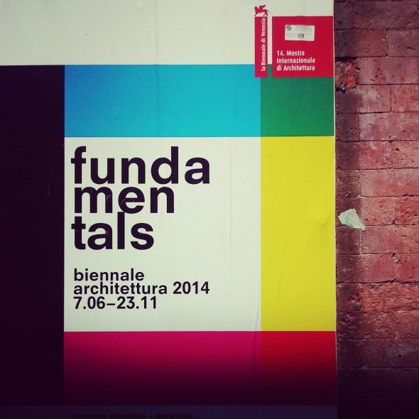
The 2014 Venice Architecture Biennale – an event that the media has elected as the largest International affair in the world of architecture – opened a month ago after much (digitally mastered) anticipation and, as expected, is generating much heated ‘debate.’
The entire Biennale affair – the themes selected, the new dynamics introduced by some structural changes and communication strategies – is worth examining as, taken together, it represents a telling reflection of the way the world of (and around) architecture has been evolving since the beginning of the new century.
Directed by Rem Koolhaas (RK hereinafter), the 2014 Biennale consists of three different shows hosted in three different venues with three different degrees of reception: Absorbing modernity at National pavilions, MondItalia at the Corderie, and Fundamentals at the Main Pavilion.
While the first seem to have generated mostly positive comments and the second mostly negatives ones, the third is the one that has proved more troublesome to most, fueling a seemingly endless string of mostly negative reactions that border, from time to time, on outright outrage.
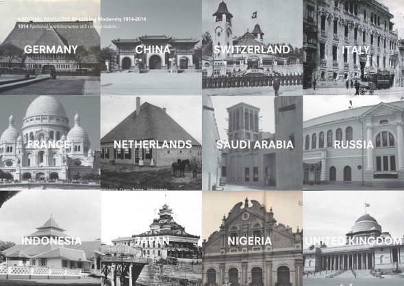
A consensus about the title preceded the opening itself: Absorbing modernity has been almost unanimously ‘judged’ a great title for investigating how the phenomenon of modernity has been translated into the different cultures/nations in which it has been developed, and the idea of having one theme for every pavilion is what makes this year edition worthy a trip to Venice.
The one theme strategy is also a strategy that has the added bonus of establishing a more logical relationship between the National Pavilions and the main pavilion, the former Padiglione Italia at the Giardini, hopefully establishing a precedent for future editions.
Since the opening, however, it has been noted that most pavilions failed to activate any serious thought about the contemporary scenario, and that those who have tried, like Argentina or Mexico or Brazil, have done so in a very didactic fashion, producing a work similar to those put together by students in architecture schools.
Information about the way in which each pavilion’s curator has reflected the eruption of modernity has been invading the Internet since the Biennale’s opening, and the reader who has not yet been to the Biennale is kindly invited to peruse at will this growing literature, which seems to suggest that the most successful pavilions are from the following countries: France, Germany, Spain, Brazil, Argentina, Mexico, Japan, Chile, and Korea, the last two being the ones rewarded by the increasingly politically charged Lions.
The pavilions that seem to have generated more spirited reactions are the Italian pavilion, which curiously houses the best (post-war modernity in Milan) and the worst (2015 Milan expo) individual sections of the entire Biennale and, generally speaking, it is made up of sections that have nothing to do with each other – the Russian – which is either considered the smartest or the dumbest, depending on who you talk to – and the Swiss – which will probably stay empty for the next six months to ‘recover’ from the exhausting (and increasingly tiresome) performance of its curator, the more than ever present presenzialista of our time, the curator of everything loosely connected to visual arts, or HUO – Hans Ulrich Olbrist – who, typically, graced the opening with a series of sensationalistic statements.
At the Biennale Vernissage, one learned that ‘Cedric Price is one of the most important figures in all disciplines in the 20th century and comparable to Duchamp in terms of influence (…). Fun palace, an unbuilt design for a flexible, open-plan structure that heavily influenced Piano and Rogers’ Centre Pompidou, is one of the most important projects of the 20th century. According to HUO, Fun Palace anticipated the Internet and the idea of participation and feedback loops. ‘It is all there and it was basically his idea.’
HUO often describes himself as one who brought architecture into the art world. At the Biennale he seems to have brought the art world into architecture, by transforming the Swiss pavilion into a sort of conceptual (and peripatetic) installation called ‘A Stroll Through a Fun Palace’ as a homage to both Price and the Swiss sociologist and urbanist Lucius Burckhardt, who developed the theory of strollology – the ‘science of strolling.’
The pavilion’s exhibition enacts the performative impulse encoded in the project’s name: visitors are invited to stroll through the space, following the trajectory of trolleys piled with drawings that are pushed by architecture students throughout the gallery. HUO has also commissioned several time-based pieces from artists and architects, including Atelier Bow-Wow and Dominique Gonzalez Foerster, which function as homages to Price and Burckhardt.
Apparently, this idea came to HUO in reaction to RK’s request to consider the influence of modernization on the past century of architecture; he hopes that Lucius Burckhardt will become a household name world over as this, to him, is the most urgent thing the world needs at this juncture.
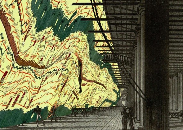
Monditialia was a show that, according to Uncube, RK did not want but had to do because the Biennale thought it was a bad idea to leave the long and venerable rope-making works of the Arsenale empty.
After all, the Corderie has traditionally been the centerpiece of every previous curator. In consequence, it looked like a good idea to turn the spotlight upon the traditional convitato di pietra – Italy itself – as the country, says RK, ‘has amazing gifts, but has difficulty realizing them.’
As a potential prototype of larger scale phenomenon happening in other developed societies, Italy is surveyed at the Arsenale in all its splendor and squalor, as if it were (and indeed is) a decomposing body sitting on a morgue’s table. The show lists 41 hot issues arranged according to geography from south to north, starting with the modernist buildings Mussolini built in the colony of Libya.
Though note-worthy in its intended political goal of waking up a nation currently in a coma state, the show comes out as a disappointment, never managing to scratch the surface of gigantic problems like illegal immigrants on the island of Lampedusa, or the Sikh festivals that now take place in the Po valley, which are dealt with nothing more than a witty paragraph and a series of pictures, or a video by the numerous members of RK’s global court, who, sadly seem to be sharing a lot of the arrogance of the master but none of the wit, or the ability to artificially make the uninteresting look interesting.
Worth noticing, in a ‘scan’ of Italy in recent times, is the conspicuous absence of issues that have become a steady presence on newspapers’ front pages in recent years, like the TAV – high speed train system – or the growing scandals around the increasingly embarrassing (and expensive) public projects such as 2015 Milan Expo or the Venice’s Mose. Thanks to the typical Dadaist timing of the Italian Magistratura, which arrested the main characters involved in it – the Mayor of Venice included – during the very first day of Biennale preview, the Mose managed to grab center stage, stealing the scene from RK himself in a curiously surreal way that RK’S elected master himself – Salvator Dalì – would have immensely appreciated.
Many participants of the Vernissage suggested that the low points of Monditalia were the back-to-back voyeuristic accounts of Antonioni’s villa in Sardinia and the video about the Maddalena fiasco – the 2009 G8 Summit than never happened – in which the architect involved, a shrewd player of the political game, plays the fake role of Alice in the Wonderland, by turning his unwillingness to see the under the table corruption that everyone but him perceived
into a public display of cheap, self-serving psychoanalysis. By contrast, the changing border on the Alps conducted by Studio Folder, which was rightly awarded a mention, emerges as the most interesting, provoking contribution of this section.
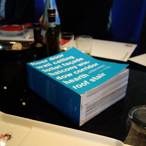
Elements of Architecture is, by any standard of measure, RK’s main contribution to the 2014 Edition. It is a section that has elicited contrasting reactions and a general sense of ambiguity about what to make of the seemingly endless amount of architectural ‘elements’ aligned, depending on one’s own sense of maliciousness, with the mind frame of a salesman, a flea market vendor, or an entomologist.
Elements of Architecture is, in fact, is the name of a megalomaniac show intending to make people conscious about the fundamental way in which, in the last 100 years, architecture has been impacted by technological development, through some of its more technologically advanced ‘elements’ – escalator, elevators, curtain wall – or by the evolution of older, more established ‘elements’ like doors, windows, balconies, ramps, staircases, you name it, or more hybrid (from a semantic point of view) ‘elements’ like the corridor or the toilet.
As well known, this phenomenon – the relationship between architecture and technological development – has preoccupied RK since the mid 1970s, when he used his time in the US to fabricate a cunning narrative about it in a book called Delirious New York, which convincingly tied the birth and the evolution of high-rises to these innovations in order to produce a new speculative interpretation – a screenplay? – for the culture of congestion.
The problem this time around and forty years later is that, although RK has become interested in expanding this investigation/inquiry at a larger, absurdly grandiose scale, he has left the underdog role. He has now become the largest, larger than life, star of the architectural world and, in consequence, he seems to have no time to produce a narrative for the massive material gathered, which, in turn, is left to the crude presence of its juxtapositions, becoming a sort of caricature of cosmopolitan hubris, without stimulating any sort of intellectual speculation or reflection.
RK now seems to be interested in a different kind of operation: in printing (in Venice) his own, new Trattato di Architettura composed not of the canonical 10 or 4 books but of 15 ‘small’ books – libretti – of architectural elements, a number achieved by adding, with his characteristic bravado, a book about toilets to Alberti’s and Palladio’s canonical number of books combined.
The strategy is not a surprise for whoever has a firsthand experience of the man’s testing personality. The books are intended to provide an almost limitless archive for future (pseudo)professional work to be performed by his own two-pronged practice: the infamous AMO-OMA couple, which is traditionally able to produce seemingly ‘interesting’ (pseudo)cultural pop collages of the critical-paranoid kind that have by now become the essential base for the most casual practices founded by former members of RK’s own office.
Embarrassed to admit his motives for obvious reasons, RK seems to have gone out of this way to disguise his real interests in a series of public presentations taking place before and after the opening.
When he presented the project in March in various Italian embassies in Europe, he said it was closer to being ‘a vehicle for research (for his practice) than an exhibition,’ elegantly sidestepping the painful notion that research requires selection, an item conspicuously missing in the overwhelming list of ‘elements’ amassed in Venice, which are closer to being a compilation of objet-trouvé aligned to create some sort of journalist scoop rather than putting forward any thesis or interpretation.
Arguably worried by the high costs that such gargantuan ambition entailed (1592 pages overall), RK characteristically set the cynical sociopolitical skills he is notorious for to work, convincing both the Biennale and the Harvard University Graduate School of Design to offer its savviest (or gullible?) students to fund his own demons/needs, cunningly disguising the fact that the books – undermining all public presentations – rather than the show is the project he really cares about.
Amazingly, RK’s hidden agenda seem to have escaped the attention of most hasty commentators present at the Biennale’s three-day-long Vernissage who seem to have inflated RK’s few selected statements delivered in videos interviewed at face value.
Questions: Was this helped by the carefully selected small group of English-speaking journalists – like “Dezeen”, “The Guardian” – with a keen disinterest about anything un-British, who gracefully accepted to act as RK’s (unofficial) press office carefully avoiding questioning any of the public reasons abducted by RK? Or by giving him ample room to play the querulous (nauseating?) role of being a victim of a larger system that, in fact, he controls better than anyone else?
The marketing strategies set in place to sponsor and present to the public ‘his Biennale,’ as he aptly put it, candidly reflects the wide spectrum of the power structure RK has been able to build through his career. In most of the video interviews [1, 2] RK seems to be interested in playing the infantile part of the victim, a strategy which is perhaps a hallmark of his entire career, if one recalls his own opinion of his own office’s name: ‘a very pretentious name, compared to which almost any realization may be found wanting.’
Narrating the reduced role of the profession to the Guardian, RK claimed that ‘architecture today is little more than cardboard.’ He went on to say that ‘architecture’s influence has been reduced to a territory that is 2 cm thick.’ For someone who, like him, has been allowed to build at the super large scale – the Beijing CCTV tower, De Rotterdam – that is a ridiculous claim to make unless one wants to consciously nurture the quite widespread passion for which architects are often hated.

The various statement produced by RK at the Biennale have been indicated as a turning point in RK’s long standing overwhelming success in twisting words, or in using his own way with words that includes a facility for obscuring difficult questions by enveloping them in rather glib statements.
The statements have been interpreted as indicating the end of a (relativist and nihilist) disenchanted line of thought that has been dominating the scene for more than two decades thanks to the backing of power institutions like the Strelka Institute or the Harvard Graduate School of Design, whose primary goal is no longer educating people through a process of developing the tools to think critically. Its new role is now to a) meet its own financial obligations by having the largest number of graduates per dollar spent and b) to make room for an increasing number of small Koolhaases – cool asses, like Colin Rowe would have it? – of second and third generation who appear to have every intention of a-critically implementing the master’s strategy for quite some time.
RK says that the work done for the Biennale is instrumental in ‘incorporating the role of the escalator and of the elevator in either the ideology or the theory of architecture’ and that the outcome of the exhibition is a ‘modernization of the core of architecture and architectural thinking as well.’
The statements sound good, interesting and perplexing at the same time, but what do they mean? Can one really believe that it is possible, or desirable, to incorporate an elevator into the ‘ideology’ of architecture?
The statements fail to achieve what other similar statements – like the role of the elevator for the establishment of Manhattanism or the role of air conditioning for Shopping culture – have achieved in the past. They fail to make something uninteresting look interesting, in spite of the show’s massive dose of supposedly witty surrealism.
‘Architecture is always written about as a serious discipline,’ adds RK. ‘We aim to lift the pressure of this constant seriousness. I think there is life in architecture.’ One imagines that the section in which the toilet is elevated to the role of an architectural element is the place where this ‘stomach life’ of architecture is occurring. Or the fireplace being replaced by a local warming application, which seems to suggest that individuals can be treated as eggs to be fried, sunny side up, please!
The show is a sort of celebration of what technology can do to space presented with the usual underlying pessimism: things ain’t what they used to be + We’re All Doomed. Paradox, one should not forget, has been one of the favorite tools of RK’s rhetoric since the beginning. Yet, this time around, the paradox is not eviscerated other than by saying that the growing ubiquity of ‘smart’ technology in architecture, for example, is not something to be celebrated: ‘It is a very alarming situation. Very soon your house will betray you.’ No further comment on these darker sides of current technological development is to be found.
‘I have been asked to direct the Biennale a number of times before, but I held out for two conditions: that I have a year and a half to plan it, and that I can sever all connections with contemporary architecture – which is not in particularly good health.’ He also added that, ‘this time it will be about architecture, not architects.’
The truth seems to lie elsewhere. The show and, more importantly, the 15 books, are neither about architects nor about architecture, if one buys the notion that architecture is still not too far from being the ‘skill of arranging volumes under the light.’
The books and the show seem to be a further, overblown mixture of omnipotence and impotence that has traditionally been at odds with RK’s Calvinistic mind. The latter seems to have grown impatient with the rules of the game he has helped himself to construct, like, for instance, the twisted art-world logics that are increasingly becoming architecture’s own fixture.
‘The Architecture Biennale was becoming very similar to the Art Biennale. Therefore I wanted my Biennale to disconnect from contemporary architecture. There was a kind of a blur and it seemed interesting to me to change and focus on architecture as an agenda. (…) It has nothing to do with design. Zero. That is one of the pleasures of the exhibition, because just as architecture had been blurring with art it has also been blurring with design. In that sense it is a rare moment of segregation.’
This is RK’s cynicism at its best. He expresses a negative thesis but has no qualms in implementing himself what he apparently criticizes.
Thanks to its mortal embrace with the world of finance, the world of art, as of late, has become a world of boring narcissistic cynicism curiously attracting all the needy ones who think it essential that they be considered ‘artists.’
RK says that he wants to leave the world of art out of the Biennale’s door, but he allows it to re-enter from the back window of the Swiss pavilion. He says he wants to stay away from the art world, but he mechanically transfers HUO’s own (pseudo)artistic obsession with endless lists of elements – the vertigo of the list? – to the world of architecture to restore some sort of (Calvinistic) ‘order’, without realizing that he is himself part of the very same world that is today histrionically dominating the world of architecture.
He seems to suggest that architecture should look back on its own history, yet he reduced this history to a pedantic and boring study of the false ceiling or the history of stairs because concomitant studies have recently been conducted by Manfredo di Robilant and by the Friedrich Mielke Institute of Scalology.
He says he wants to go back to architecture proper, yet he remains silent about the stasis in which architecture finds itself today: the stale pool in which architecture is either boring, needlessly spectacular or simply unable to find relevance beyond itself.

What then is the message of the 2014 Biennale?
Judging from public presentations of the event done in the spring, one was led to believe that a three-pronged message was in the cards.
First : that the Biennale had an obligation to become a research center rather than a market-dictated parade of the who is who in architecture.
Second: that it would have emphatically criticized the growing divide between architecture and civil society, a divide that has created an artificial and ill-directed dichotomy between excess and indifference, fostered by economy and technology.
Third: that it would suggest, between the lines, that architects should shoot for a more generic, anonymous kind of architecture made of basic, fundamental elements that can act as a reference for a regenerated relationship between human beings and architecture.
At the end of the day, a very pale version of all of the above is perceivable for those who are equipped with enough positivism to extract something like this from the encyclopedic, unedited amount of material piled up by RK. His narcissistic Calvinism of data, compulsive mapping, outdated wit, and marketing slogans ready to be quickly spent on the market, appear now tiresome, out of touch, and even at odds with the very pace of a contemporary culture characterized by an increasingly shorter attention span. More than anything, they just appear as a formidable mixture to induce boredom, or to make architecture look like a boring, narcissistic affair, as many have remarked.
For someone who boosted the idea of permanent reinvention, for someone who dismissed context and who likes to think of himself as surfer on the waves of history, RK appears to have hit an uncontrollable Venetian anomalous wave that has broken, putting a temporary, yet spectacular end to his long-term successful surfing. It has forced him into a self-made Venetian prison cell with no exit in which he himself, like everyone else, seems bored to death to even look at the cabinet of curiosities with which he has narcissistically adorned its austere brick walls.
Trapped inside he only seems to be able to walk through it without a chance of getting rid of the lead ball he himself has chained to his leg: the self imposed tyranny of provocation, or the tyranny of having to do the opposite of what everyone would do, coupled with the sadness of a 70-years-old man still wanting to be a bad boy.
He looks at the paranoid collage of mute elements unable to deliver any sort of dialogue: the field is flat, with no significant feature able to hold his interest or attention, or ours.
A Bridge of Permanent (bored) Sighs??
Questo sito usa Akismet per ridurre lo spam. Scopri come i tuoi dati vengono elaborati.




Lascia un commento