ITA | ENG
© Petra Appelhof
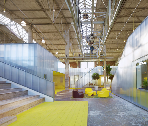
Recycling is a big issue in the Netherlands today. A large proportion of the building stock is vacant, awaiting renovation or re-allocation, including premises with unsuspected qualities just waiting for people with initiative who can spot this potential.
© Ector Hoogstad Architects
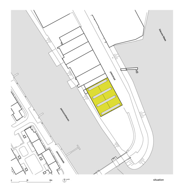
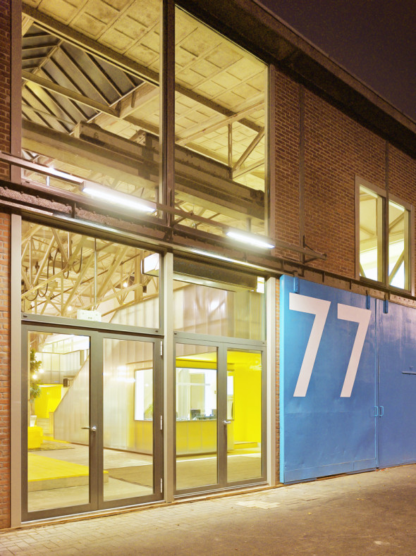
So too this steel plant on Rotterdam’s Piekstraat; not an obvious location for an office, but enjoying a unique position with views over the river Maas. What made the building attractive to IMd was the vast space, dominated by an imposing steel structure.
© Ector Hoogstad Architects
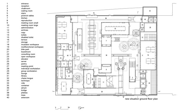
Renovation of the existing shell of the building soon proved an unrealistic option, in both the technical and financial sense. Finally, a strategy was chosen whereby all the work areas were created on two storeys in air-conditioned zones against the closed end walls. From there, they look back into the hall, in which pavilions with conference areas were created, interlinked by footbridges and different types of stairs.
© Ector Hoogstad Architects
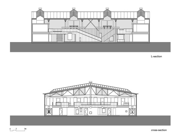
The hall itself has become a weakly air-conditioned cavity, which lends itself very well to informal consultations, lectures, exhibitions and lunching, for instance. Large new windows in what was originally a closed facade, in combination with the existing skylights in the roof, provide daylight and magnificent panoramas over the water.
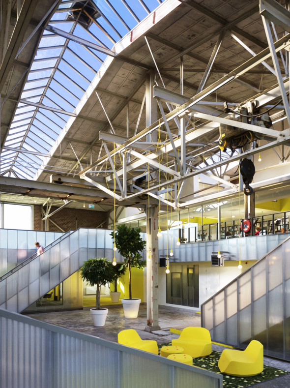
© Petra Appelhof
According to architect Joost Ector “It is an unusual layout for an office building, but it does have some big advantages. Users are not directed away from the organisation, but are continually in contact with its spatial and social heart“.
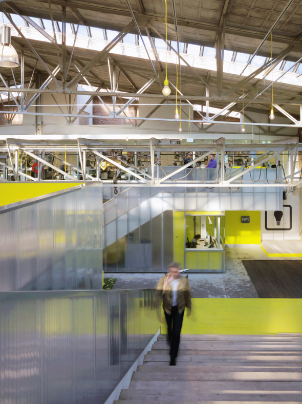
© Petra Appelhof
“That stimulates encounter and involvement. It also gives the hall an optimum spatial tension: bridges, underpasses and stairs mean that you can stray and, in this way, experience the space and the people within it from ever-changing perspectives“.
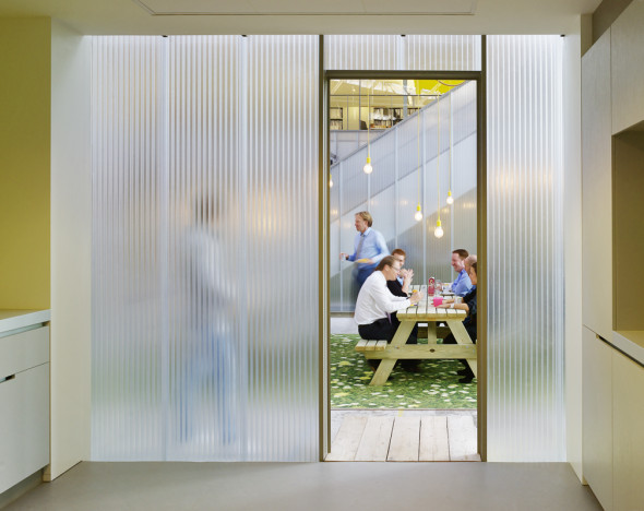
© Petra Appelhof
“By not air-conditioning the whole hall, but just the pavilions, energy consumption was also reduced to a minimum. Combined with the decision to use light, recyclable materials, an existing building as basis and the positive boost for the surrounding area, that produces an extremely sustainable project.”
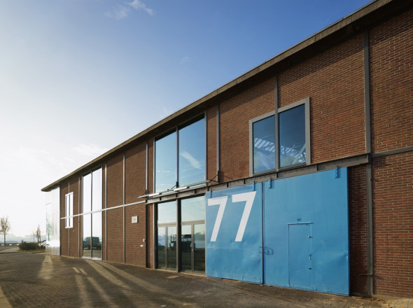
© Petra Appelhof
Everything that was already there, such as the steel skeleton, the concrete floors and the masonry on the facade were just cleaned. New additions were made using a limited number of materials which are new, but which are very much in keeping with the industrial atmosphere; rough wood for stairs, clear glass and sheeting of transparent plastic.
© Petra Appelhof
This sheeting makes the new walls nicely diffused, and even slightly “absent”. The consistent use of one colour – bright yellow – unites the whole even more.
Gallery
Credits
Pagine: 1 2
Lascia un commento