TOOLBOX: a professional incubator
© Caterina Tiazzoldi
“In Turin, Italy, there is a new box, Toolbox, which is a large container of professional tools and the way to use them.” REFERENCE?
Toolbox is a project based on the transformation of 3 floors of an office building (about 4,500 square meters) which was conceived to respond to the transformation of the city. Traditionally, Torino’s professional structure was largely related to an industrial setup (FIAT cars, Pinifarina, etc…). Nowadays Torino’s professional reality is increasingly represented by freelance workers.
The intervention, designed by Caterina Tiazzoldi, focuses mainly on the ground floor. It is conceived to create a functional and architectural rehabilitation of the entire complex. Toolbox has been conceived as a professional incubator. Its design has been created for a new generation of professionals (architects, web designers, artists, lawyers, accountants and independent contractors). Derived from an hybridation of traditional European working spaces (organized in small offices) and the American open space model, Toolbox has been conceived as an attempt to invent a new approach to work.
The concept of Toolbox has been built on two mains ideas: the coexistence of a plurality of users and uses of the space and topological hybridation.
The initial question was: since nowadays anybody can work remotely from anywhere by using a laptop and a wi-fi network, why should people need a workspace? Why do we need a working space? In effect, after the first stage in which home working appeared as a real alternative to the traditional working environment, people rediscovered the need for spaces dedicated to work. Mostly office space is needed for three reasons: socialization, professionalism in front of other people but mostly in front of ourselves, and the distinction between relaxed and professional environments. What should professional space look like for the new generation of Italian professionals?
The project was developed by modulating privacy and sociability levels, work and leisure gradients, and formality and informality ranges.
One of the earliest problems was to reconcile the plurality of users and requests for the coherence of the architectural concept.
Who was the project addressing? How was it possible to create a rational structure with a multitude of users, needs, expectations and ways of working?
How to balance diversity and coherence? Especially how to invent a sustainable plurality?
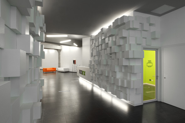
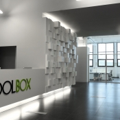
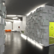
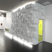
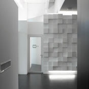
Diversity and variety are considered key values of the Toolbox concept. For this reason, the walls in the reception area were made with 500 cubes of various sizes, used as a signage to indicate the location in the building of the different functional areas (meeting room, relaxation area etc.). The first message to convey to visitors was of a whole and coherent set obtained by adding together different elements. To emphasize this aspect, the wall makes use of a parametric device which has the capacity to redesign several configurations of the same wall in accordance with different needs. This aspect was conceived to describe the project as a whole, in that it can be reconfigured in accord with a variety of users’ needs.
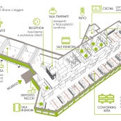
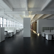
From a functional standpoint, the intervention consisted of transforming a traditional office space (with enclosed spaces) into a vast open space with 44 individual workstations, interspersed with communal areas including meeting rooms, printer rooms and informal meeting spaces.
The goal was to keep the original industrial concrete structure as intact and visible as possible.
The main building of the industrial block was divided in two parts by inserting a series of filter spaces used as technical rooms and lockers for storing equipment.
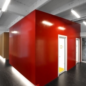
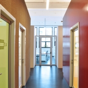
The side facing the windows has been used for co-working workstations. On the opposite side, a corridor and 5 enclosed boxes contain the functional common services (kitchen, meeting rooms, mailboxes, bar, etc.). The service areas have been conceived as “working tools”.
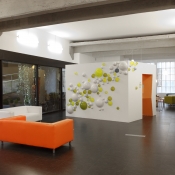
In the secondary industrial space we have developed a lounge, bar and relaxation area. Again the double concrete beams have been left exposed and the service spaces (e.g. the bar) have been enclosed in functional boxes
- Uniformity and variation
In contrast to the homogeneity of the organizational concept of the overall space which has been achieved by design consistency, changes and local alterations of the original rules have been applied. In this way it was possible to create a feeling of plurality and multiplicity as part of a consistent design scheme.
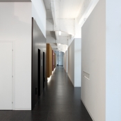
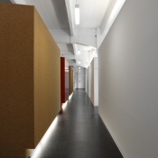
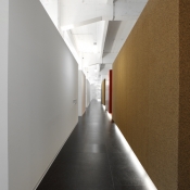
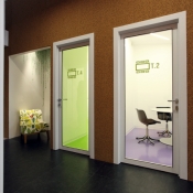
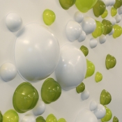
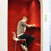
Volumetrically identical elements, such as the functional boxes overlooking the corridor, have been differentiated by the modulation of the materials used (using different types of finishing – cork, glazes, acoustic insulation, etc.). This differentiation wasn’t only visual. It was also undertaken to specialize the performances of each functional space (augmenting acoustic insulation in the meeting room, terminal insulation to reduce energy consumption in the room connected with the building parietal wall, etc.). From the spatial point of view, the objective was to convey the impression of a harmonious coexistence of different worlds and cultural references. The principle of variation and transformation of the same element was also pursued inside the spaces, differentiating the color of natural rubber floors of the meeting rooms, or varying the levels of transparency and the diameters of the bubbles that form the external texture of the cube-bar.
The idea of gradation and variation based on the manipulation of spatial attributes (color, transparency, thickness) is one of the characteristic of Caterina Tiazzoldi’s work. Variations in terms of the same element was also used to obtain different spaces, different gradients of socialization, privacy, relaxation or work. Visual and functional modulation evolves in parallel..
- Lighting:
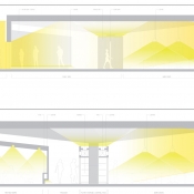
The most striking characteristic of an industrial building is the way that light is distributed in the space; it is thin, rarefied, almost vaporized by the large openings.
The goal of the project was to preserve this feeling of “suspension” by creating a rhythm of volumes based on the distribution of the windows.
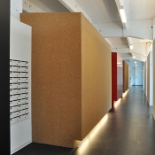
The filter boxes dividing the building into two spaces allows us to have a degree of light variation between the co-working spaces, the hallways and the boxes of the service areas. Natural light comes directly into the co-working spaces, but penetrates the corridors with the rhythm of the technical space central volumes. In the central span, the volumes of the technical spaces and the service box are perfectly aligned in order emphasize the rhythm of the natural light cuts The succession of the volumes, all of identical height, and the variety of materials, transformed the corridor into a kind of urban landscape, a promenade, overlooked by the boxes as if they were buildings.
The artificial light, fully realized with low energy lights, mixes with the natural light. In the evening, in the corridor, a series of neon lights, facing from bottom right and top left, scans the rhythm of the space.
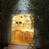
The small patio area, which contains bamboo, is a well of light that illuminates the kitchen space.
- Formal or informal?
What is the right level of severity, formality and solemnity for a workspace designed for independent workers? What is the best working environment? What is the best environment for stimulating professional production? In which environment are we, and do we feel professionals? In what kind of space are we better represented? What is the level of socialization we expect,? What is the level of privacy?
The Toolbox project has been conceived with different gradients of privacy, different settings and environments, working areas with different gradients of intensity. In the last decade, most professionals appreciated some of the positive aspects of working at home. The possibility of performing repetitive tasks on a couch with the computer on the knees, leafing through a document in an armchair, etc. … Some of the home-working habits naturally became part of our working lives.
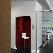
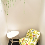
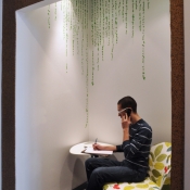
For this reason, the project developed various kind of settings and different gradients of intensity in the way that we approach work. The spaces and their language reflect this concept – strict, almost austere for the co-working area, bright and colorful for the sofas and micro-meeting rooms,, areas where work and meetings are conducted in a more relaxed mode. The telephone pods are located some distance from the co-working areas to allow private phone calls or conference calls.
In this way everyone can follow his or her particular inclinations or variations during the working day.
Gallery
Credits
- progetto > concept: Caterina Tiazzoldi, Aurelio Balestra, Giulio Milanese; progetto: Caterina Tiazzoldi; con A. Balzano, G. Bonavia, H.Cany, C.Caramassi, L.Croce, M.Fassino, M.Pianosi.
- localizzazione > via Agostino da Montefeltro 2, Torino
- tipologia >interni | uffici
- superficie > 1500 mq
- cronologia > 2010
- crediti fotografici > Helèné Cany
Questo sito usa Akismet per ridurre lo spam. Scopri come i tuoi dati vengono elaborati.


Lascia un commento